Set on the highest point of one of Brisbane’s inner western suburbs, Shaun Lockyer Architects’ Graphic House is inspired by the principles of modernism and driven by a highly distilled approach to design.
Products
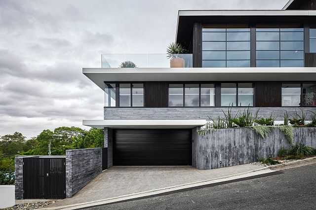
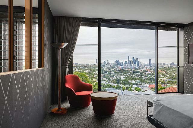
Situated on the corner of a very quiet street, “with panoramic easterly views of the city and southerly views right around to the south-west across the local district to Mount Warning, it’s an incredible site, to say the least,” says Shaun Lockyer. Taking advantage of the elevation, the home steps down the site and culminates in the pool at the base of the building. Each of the four levels is stacked as a series of cantilevered volumes, creating a strong modernist design language that emphasises horizontal lines and rectilinear forms.
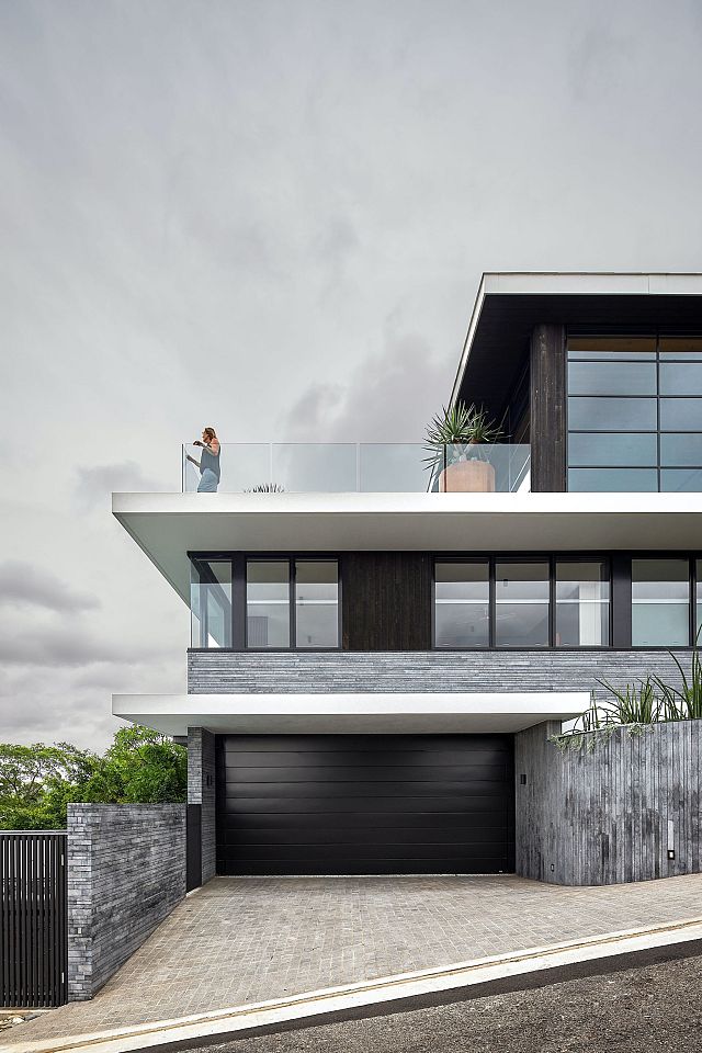
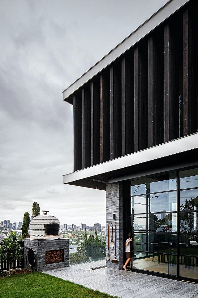
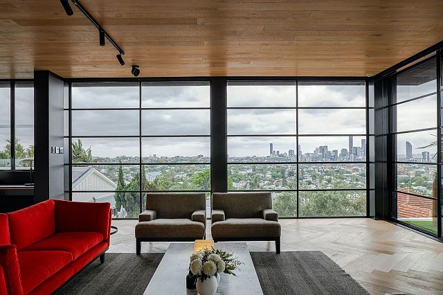
“The clients are incredibly informed about design and had a very high understanding of the quality of what they wanted and a clear idea of the architectural outcome they were chasing,” explains Shaun. “Their interests are very much modern in the traditional sense, and they loved the idea of strong horizontals.” Identifying a relatively limited palette of natural materials as sympathetic to these modernist design aims, the two most striking features of the house to the outside are the charred timber screens that veil the building and the extensive use of finger jointed limestone cladding. Within this restrained palette, the lines of the concrete slabs are accentuated to establish a datum that is key to the home’s modern identity.
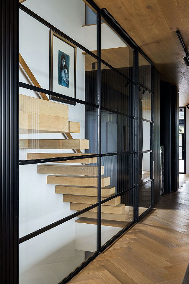
The materiality of the exterior also points to the clients’ emphasis on quality and achieving a truly bespoke outcome. “Due to the cost of real estate and building, most people tend to build a lot more than they need in the name of maximising perceived value for the next potential buyer,” Shaun says. “This house is the exception to the rule. The clients have seen the project as designing for just themselves and for how they want to live in the site, which is surprisingly rare and truly admirable.” Cladding the outside in stone rather than a cement render, using steel-framed windows and doors, and selecting charred timber rather than fibre cement “speaks volumes to the clients having a very clear idea about the quality of what they wanted to be executed,” says Shaun.

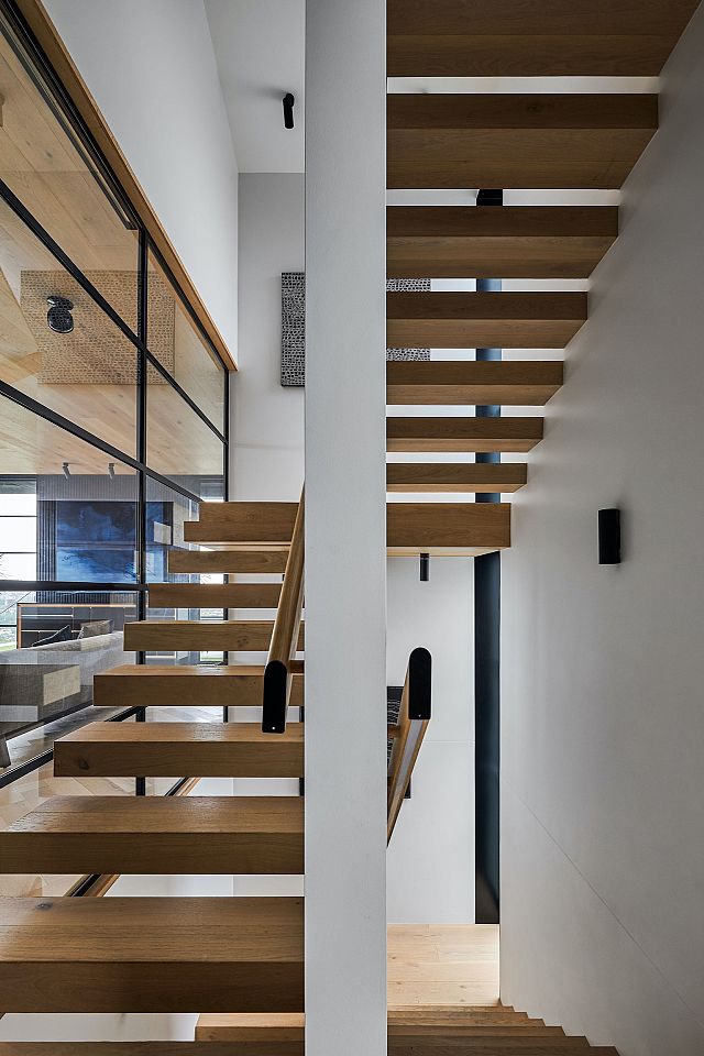
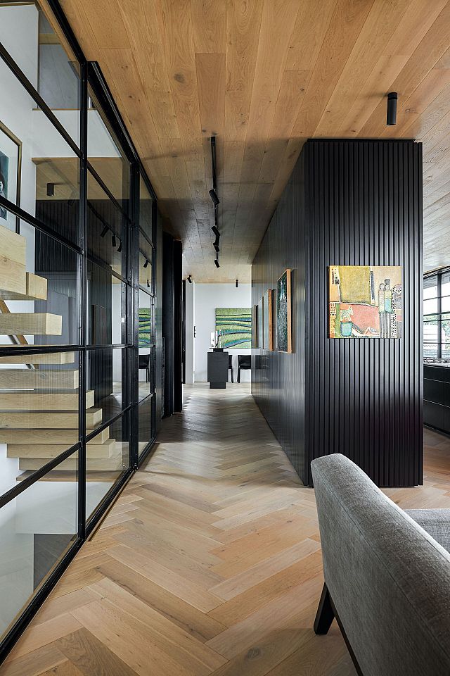
Stepping inside, the home is generously scaled without being excessive, with efficient zoning delivering the functionality the client sought. The garage, office, grandchildren’s bedrooms, bathroom and laundry occupy the lower two levels. The middle, most significant, level flows from the entrance at street-height into an expansive kitchen, living and dining area out through steel-framed glazed doors onto a large roof terrace. The top floor is given over to the master bedroom and bathroom. “It was very much a downsize house for the clients. They still wanted a house for grandkids and a big entertaining space, but they didn’t require multiple living rooms or home cinema or gym. We ensured that there was nothing superfluous to the brief,” Shaun says. With an emphasis on quality of finish over quantity of rooms, the philosophy of a restrained material palette carries through internally.
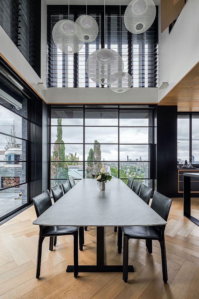
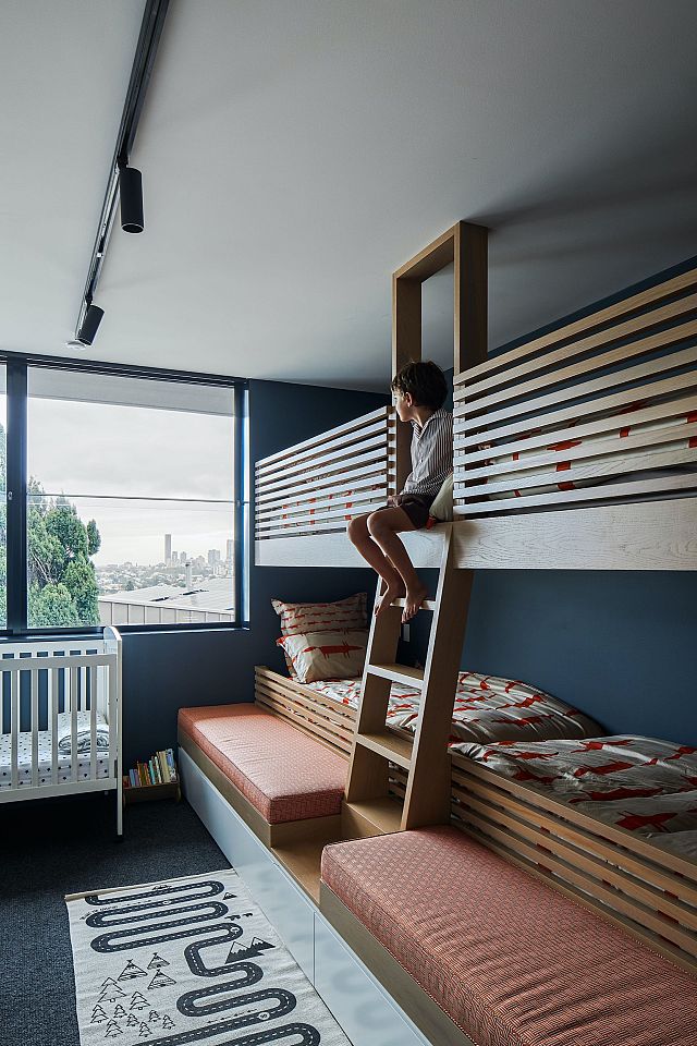
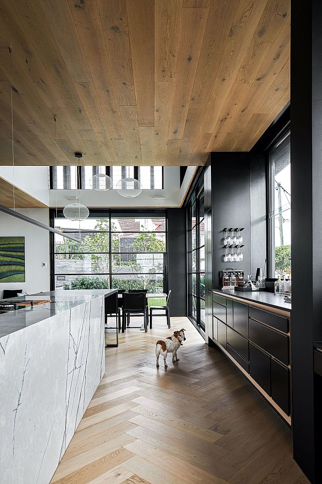
The interior is defined by the use of black textured wall panels and French oak, which lines the walls and ceiling. “It is very sympathetic use of black in what is a very bright house – its long axis is all east-facing glass, and at every moment of the day you experience the change in the light. Black cools the space psychologically as a counterpoint to the bright edge; there’s a sense as you enter that it’s a bit cooler in terms of colour and feel,” explains Shaun. The black panels also create a subdued, atmospheric space in which to hang art, with a circulation spine running behind the kitchen becoming an art gallery displaying the client’s collection.
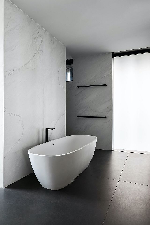
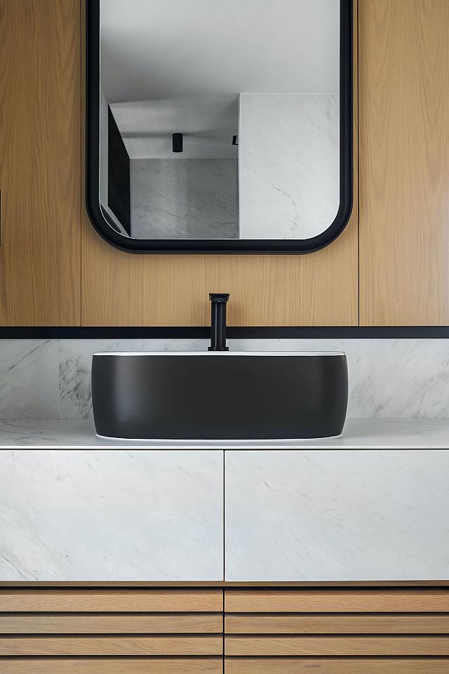
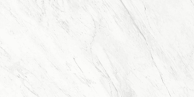
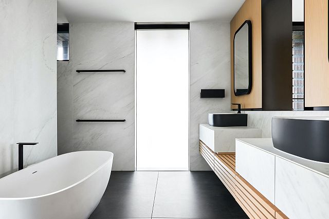
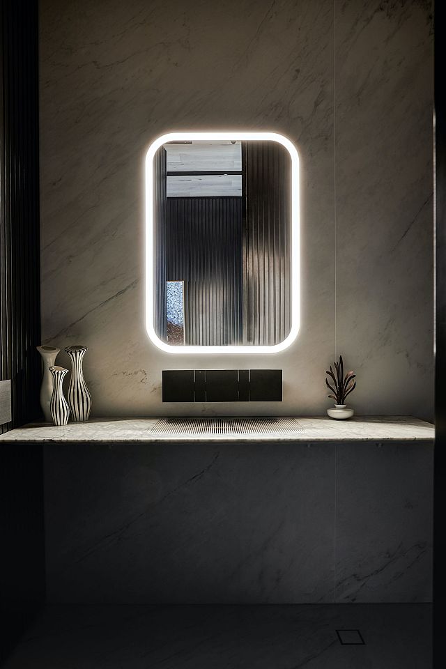
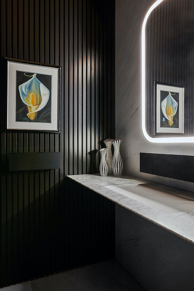
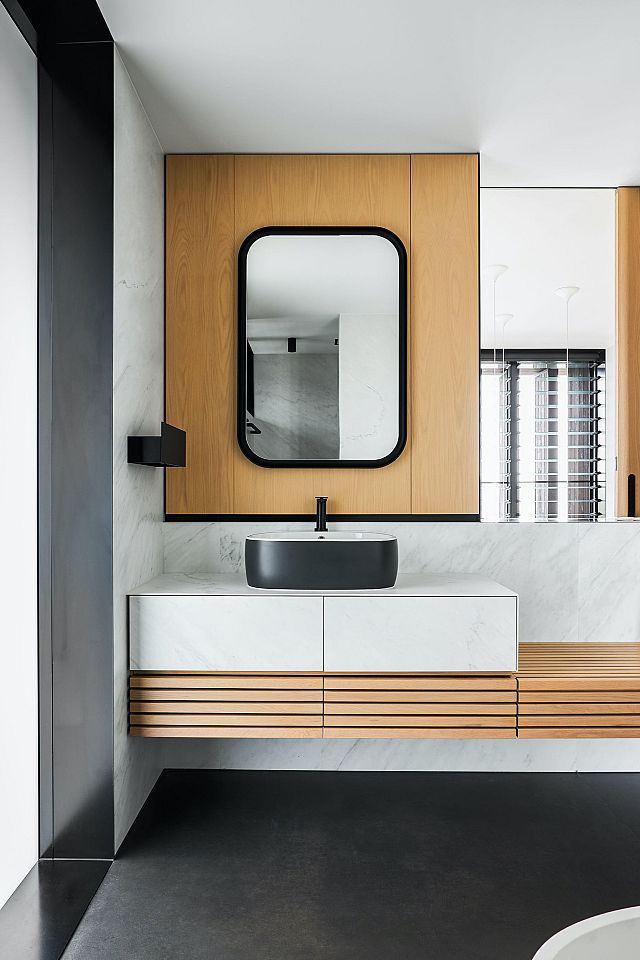
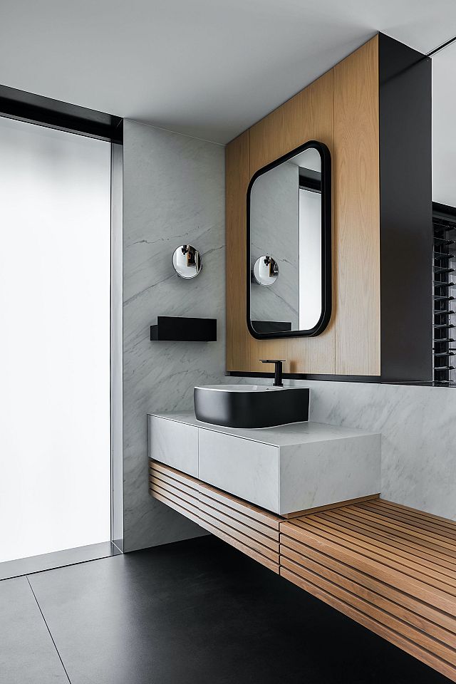
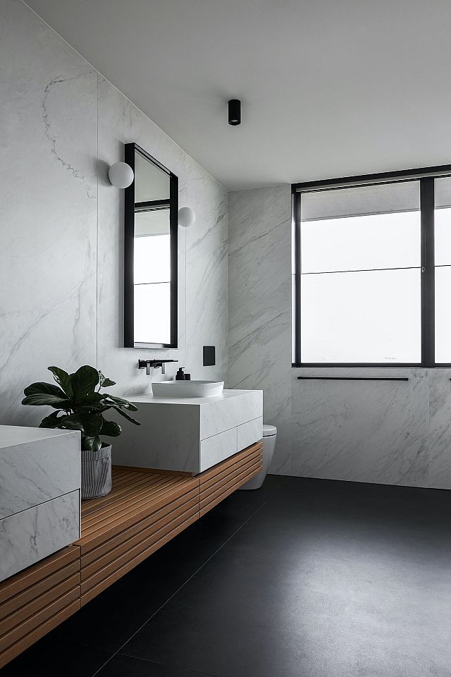
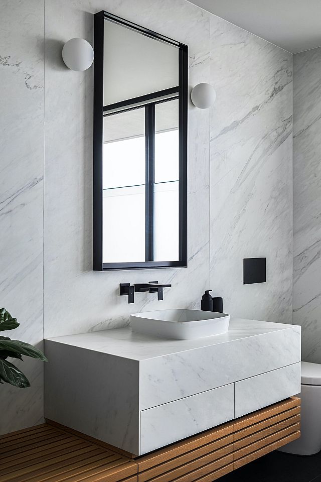
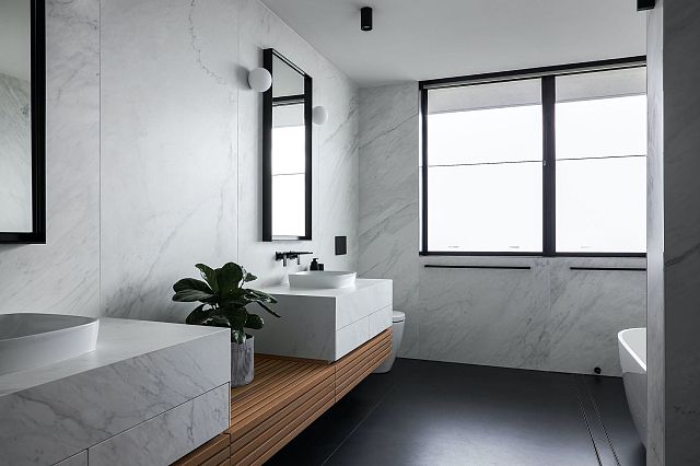
In the bathrooms, the palette is complemented by very large porcelain panels by Artedomus. “A very luxurious approach was taken to the bathrooms,” says Shaun, with dramatic concealed strip lighting, and porcelain lining not only the walls and floors but the vanities as well. The Italian-designed panels, at 3,000 by 1,500mm, create a seamless surface and, with a fine profile, are lightweight yet extremely durable. “The beauty of the porcelain we got from Artedomus was the sheer size and the fact we could get the number of slabs needed and colour match,” he reflects. “Even drawer fronts were done in porcelain, giving the spaces a beautiful sense of consistency.”
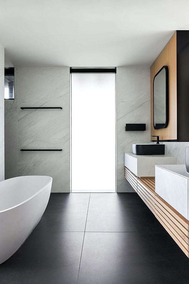
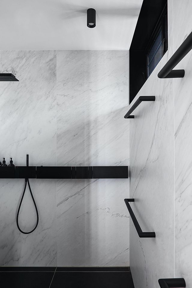
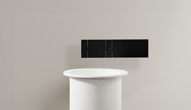
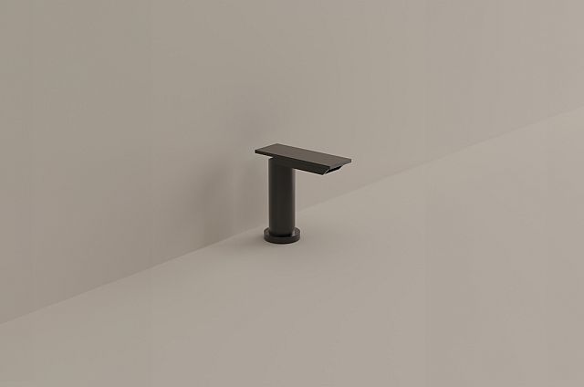
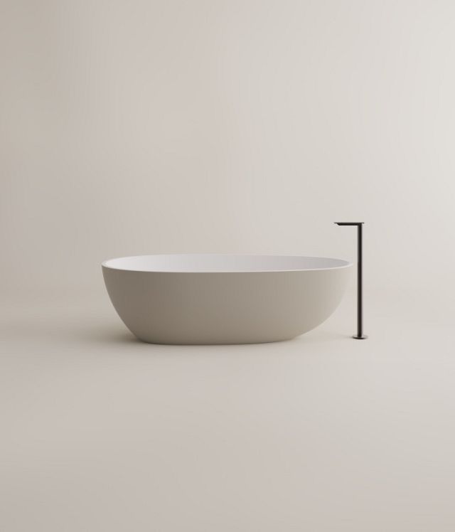
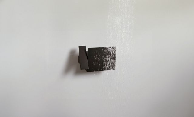
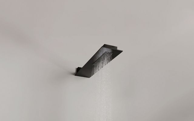
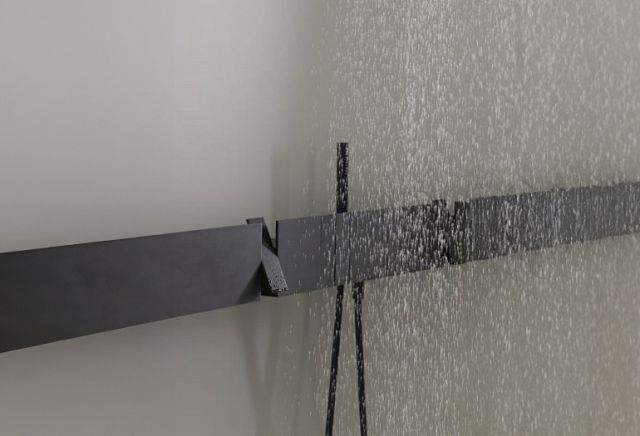
The Agape Sen sanitary fixtures and fittings were also sourced from Artedomus and “form a very important part to the detail execution of this house,” says Shaun. “The attention to detail and craft of construction of this range extend our design philosophy from the broader architectural idea into the tactile, finer-grain execution of the house.” He describes the Sen range as a very “architectural” range of fittings that were not only a natural fit in the overall concept of the house but add “a sense of occasion to an element of the house which is so often overlooked.”
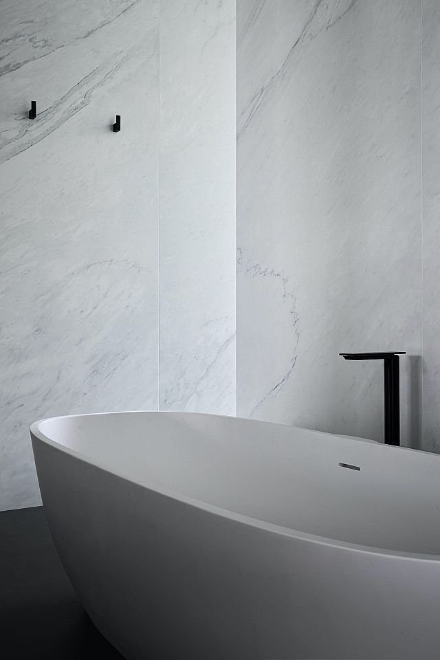
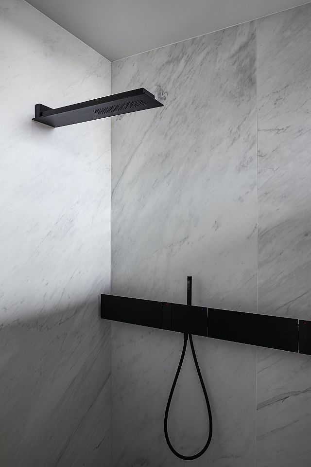
Each space is united not only by the distinctive approach to materiality but also by a “sense of event – that around every corner is something of interest,” Shaun says. This is experienced from the moment one enters past the curved black panel that encloses the entry and takes in the drama of the view through the expanses of steel-framed glazing. “The material palette is restrained but the house itself is not,” says Shaun. “It is rather theatrical; it’s all about the view, the art, and entertaining.”
The kitchen, at the centre of the main space, has a seven-metre long bench that speaks to the theatre of gathering people together and preparing a meal. Meanwhile, almost every wall is actually a piece of cabinetry, and at every edge is a bar, or a terrace or door opening to somewhere else. “There’s a sense that the building is waiting for something to happen all the time,” Shaun summarises.
Yet it is a testament to the architecture that, when the clients are not entertaining, the home comes to rest at a scale in which two people can still feel comfortable. While nothing about the space changes apart from the number of people within it, the design offers the ability for the home to seemingly expand and contract depending on its function. Above all, it is perhaps this quality which exemplifies the bespoke nature of the architecture – creating an unmistakable sense that this is a home designed just for its inhabitants, down to the finest detail.
featured products
MAXIMUM Michelengelo
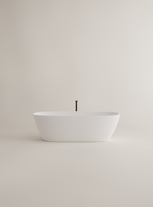
Agape Normal Bath
MAXIMUM Moon
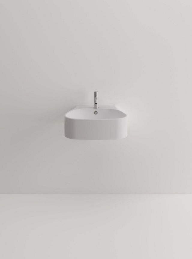
Agape Pear Basins
Agape Sen Tapware and Accessories
Agape Memory Mirror
Agape Ell Basin in Bianco Carrara marble
architecture
Shaun Lockyer Architects
photography
Andy Macpherson
Build
Thallon Mole Group
Words
Rose Onans
Landcsape
Steven Clegg Design
This article originally featured on The Local Project.
