As a collaboration between Pop Architecture and Karyne Murphy Studio, Fallow House benefits from the rigour and cooperative spirit of the project team, presenting a pragmatic and finely crafted response to brief and place. Nestled in a quiet suburban setting in Melbourne, the home brings materiality and expression of form into dialogue, skilfully fusing site, structure and landscape into a holistic proposition.
Products
With an interest in building a new home, the clients first approached Karyne Murphy Studio to discuss their needs and aesthetic sensibilities. “I had a long-standing relationship with the clients and felt Pop Architecture’s work aligned well with their vision,” reveals Karyne. Delving into the project as collaborators, the team helped to distil the core objectives, working to emphasise natural light and ventilation, facilitate efficient circulation, access and entertaining, and create a beautiful, tactile experience of home. “The house embodies our clients’ lifestyle with a series of spaces that promote the way they live and interact with their family and friends,” says Pop Architecture Director Katherine Sainsbery.
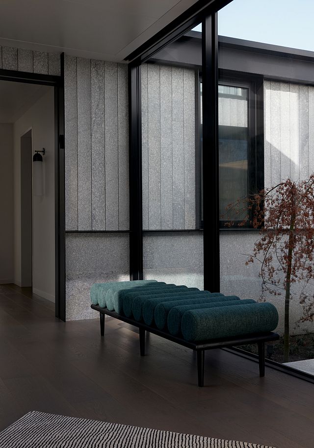
Designed as a generous house for two, a core tenet of the planning was to create separable zones for the clients to activate spaces according to their needs. “One of our first moves was to split the program into two parts with a courtyard in the middle, so every space has equal access to northern light, ventilation and landscape,” Katherine says. Essentially designed in two halves, the front portion of the home accommodates a luxurious main suite on the lower level with guest rooms above, while the single-level rear contains living and entertainment spaces. A glazed link connects the two buildings – a central transition zone passing through the landscape.
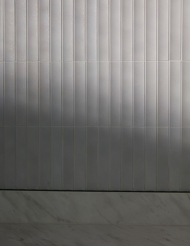
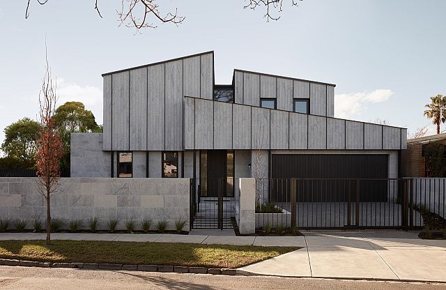
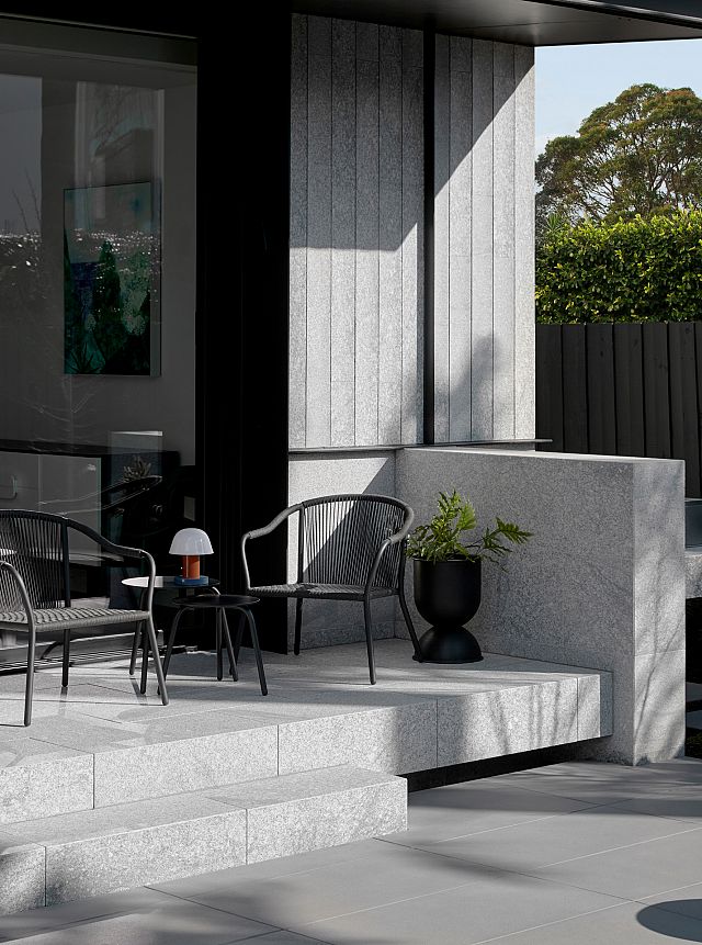
The ‘split’ concept is reinterpreted in the front façade, where a graphic composition of geometries skilfully break down the scale of the building to the street. “In developing the architectural form, we were inspired by the ubiquitous 1980s tiled roofs in the area,” Katherine recalls. “There’s a great series of works by Bill Henson, which elevates the landscape of suburban tiled roofs to an abstract and dramatic texture.” Pop Architecture explored this interpretative method, conceiving the upper level as collage of fluted roof forms, grounded by the solid expression of the lower level. Stepped and textural, the façade changes in character throughout the day as light shifts across its surfaces.

An interest in translating the effect of the roofscape cladding into the interior sparked an ongoing relationship between the design team and Artedomus. “The INAX Sairin tile was an early selection and really prompted us to explore the Artedomus range,” reveals Katherine. “As the design developed, Artedomus was enthusiastic about understanding the overarching themes of the project and making suggestions that would complement these, introducing us to products which we may not have considered otherwise.”
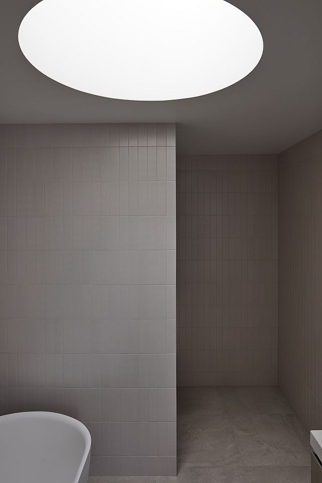
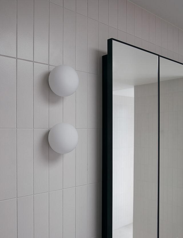
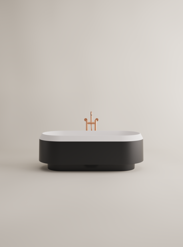
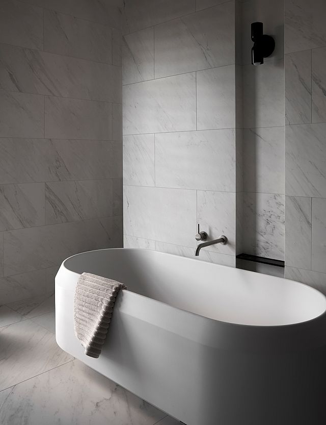
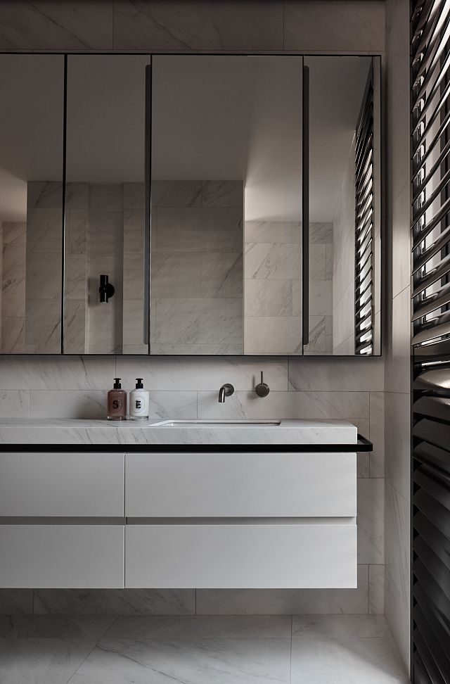
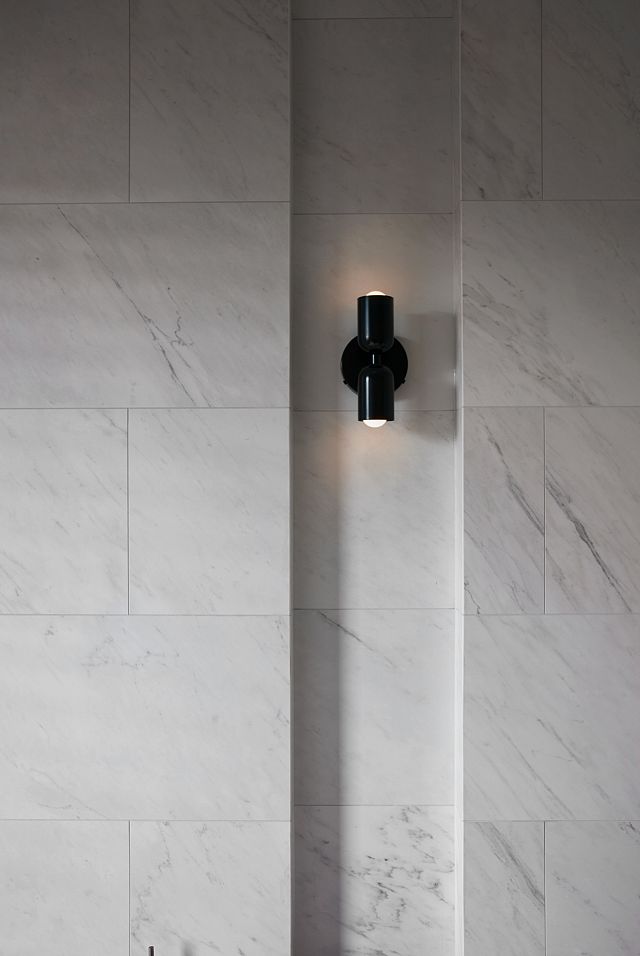
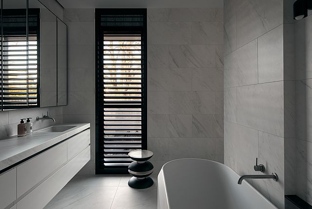
MAXIMUM Michelangelo porcelain sheets, supplied by Artedomus, create a fine-grain interpretation of the solid stone shrouding the front portion of the home. The versatile porcelain envelops the ensuite floors, walls and vanity, the off-white surface and gentle striated veins drawing focus to the precise form of the freestanding Lariana Bathtub, designed by Patricia Urquiola for Agape and supplied by Artedomus – a sculpted centrepiece for the space. “The versatility of the Michelangelo sheets allowed for continuity through the house,” Katherine says, noting the use of the product on the powder room wall and bench, and bench-top surfaces throughout the bedroom robes. As Karyne explains, “the pattern is convincing as a natural stone without the practical limitations of working with a solid material.”
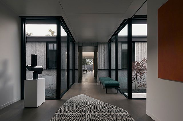
The main bedroom is mirrored by a separate study space, each offering captivating northern views to the courtyard, thoughtfully landscaped by Amanda Oliver Gardens. Beyond, the ribbed and solid form cladding of the northern building sails into the glazed walkway, introducing a defined datum that is devotedly referenced throughout the public areas of the home. Acoustic panelled ceilings effectively dampen sound, while the landscaping elevates the home’s circulation spine with a sense of verdant energy and movement. “The clients are avid entertainers, so the rear of the house is planned to host large gatherings of family and friends,” explains Karyne, recalling the home’s generous kitchen and meals area to the west, with a formal dining area and lounge to the east.
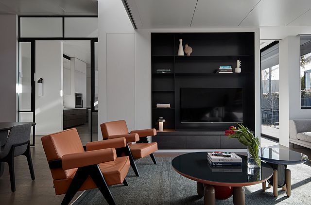
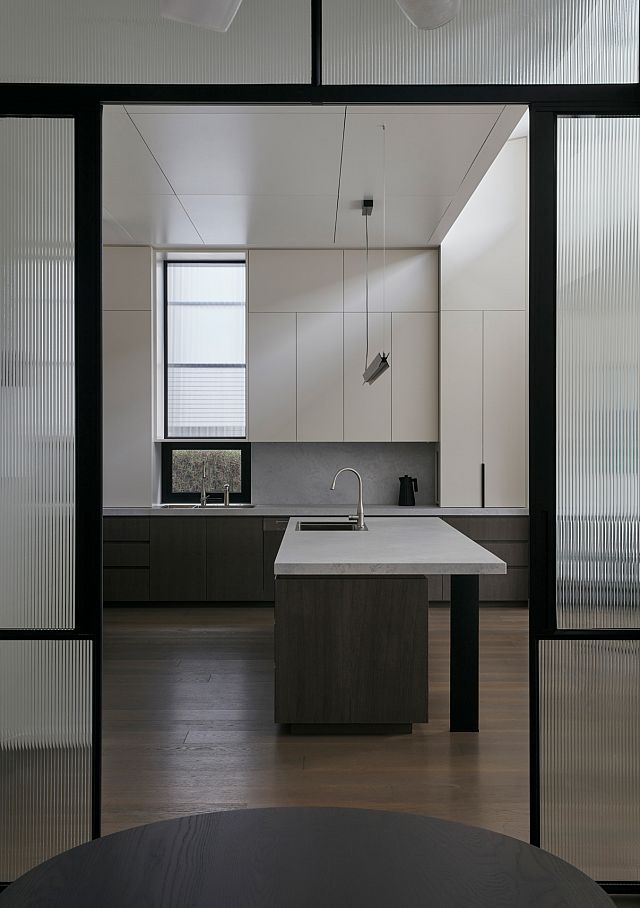
With a preference for minimalist interiors, the clients sought a spatial solution that would feel effortlessly presentable, informing the arrangement and finishing of space. Ancillary zones for storage and preparation are stacked along the southern edge, allowing the voluminous, visitor facing spaces to maintain clarity. Broad sliding doors draw in northern light, complemented by clerestory windows that invite beautiful sways of light to permeate the floorplate. Bold steel framing surrounds views to the garden, creating a graphic interface with the planar forms of the rear podium deck and roof canopy. Cavity sliding doors give flexibility for the clients to expand the everyday kitchen and meals area into the formal dining and lounge areas, while stacking operable panels give further capacity to segment the space to suit various group sizes and spatial needs. “These moves allow the clients to actively tailor their home to create a series of connected spaces that work for small or large groups,” Katherine says.

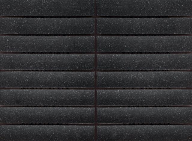
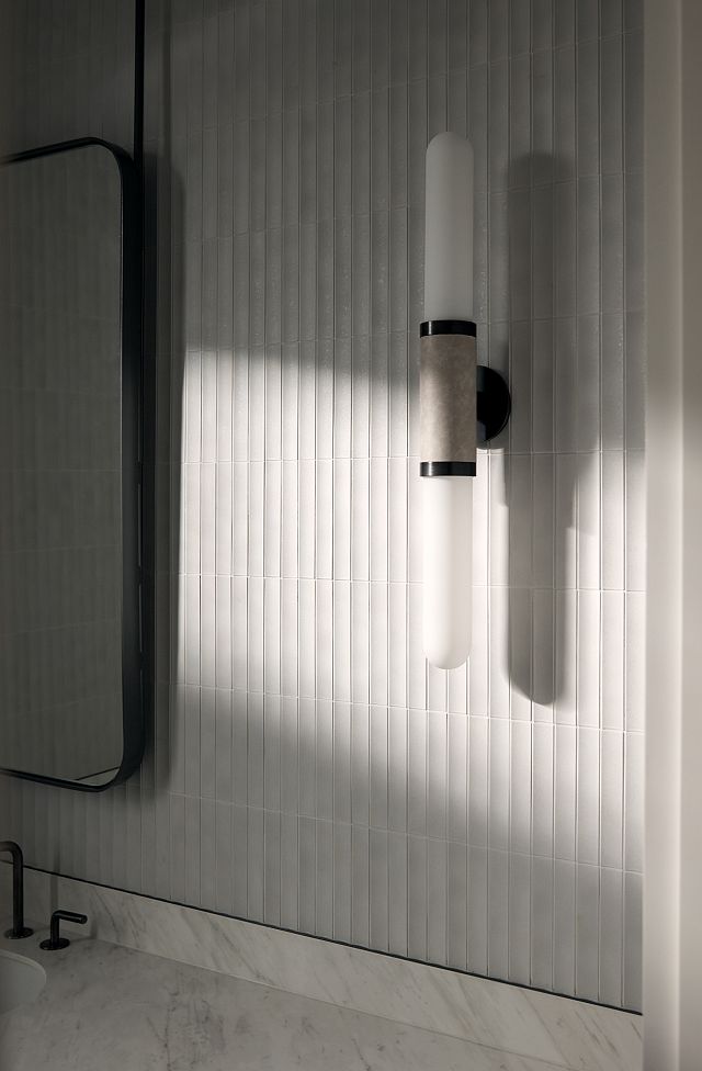
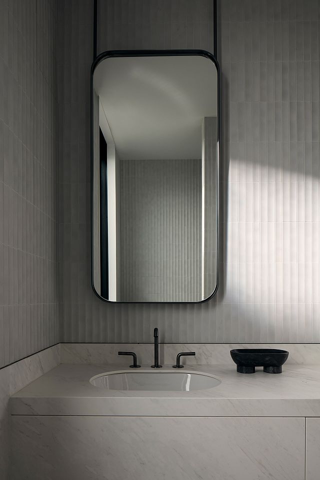
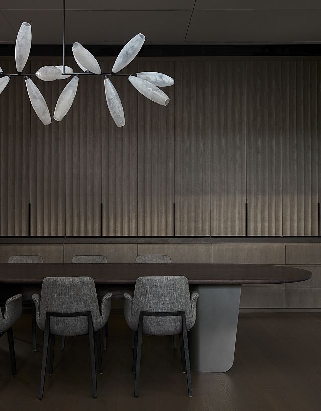
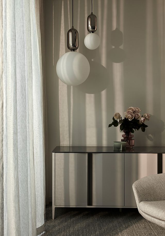
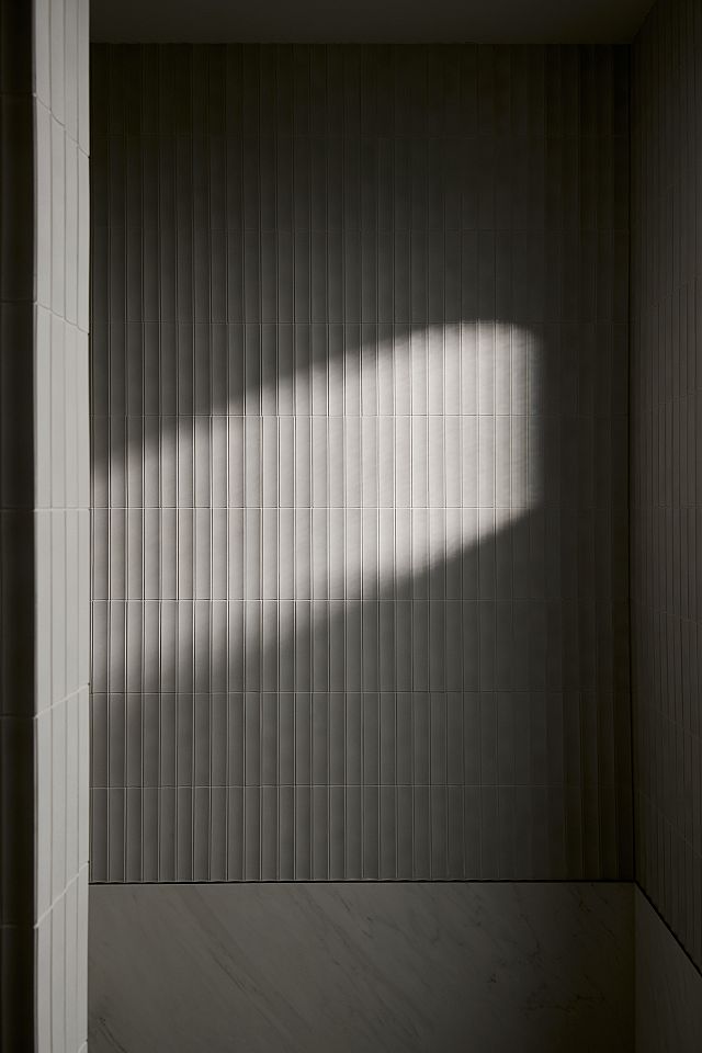
A custom buffet to the dining space is finished with fluted door panels and Artetech Beton Graphite porcelain panel from Artedomus – a robust, concrete look product referencing the dynamic textures of the architecture and complemented by the fragility of the Gem Branch Chandelier by lighting designers Giopato & Coombes. The beauty of the fluted profile is echoed in the guest powder room, where a datum of MAXIMUM Michelangelo porcelain meets INAX Sairin SAR-1C tiles. Manufactured in Japan and supplied by Artedomus, the gentle scalloped profile of the Sairin tile creates a captivating interplay of shadow and light, illuminated by a striking collared wall sconce by Articolo. Karyne comments, “the space has a luxurious feel while still being incredibly hard-wearing.”
Upstairs, a series of refined guest spaces allow the home to accommodate extended stays of family and friends. The bathrooms follow a pared back tactility, with INAX Plain Plus wall tiles in white matte creating a powdery, subtly gridded finish and Italian-made Fiandre Core Shade tiles bringing subtle movement to the floors. “These high performance Artedomus products are layered to give great texture and interest,” reveals Karyne. Throughout, the mellow warmth and grain of European oak floors and a layered approach to furniture and lighting complements the home’s minimalist palette, creating a nuanced expression between spaces. “There’s a real emphasis on long views within and beyond the house, creating connections to the landscape and the suburban context,” muses Katherine.
Drawing on skilful proportions of solid, textured and modular finishes, Fallow House creates a synergetic expression between inside and out – a testament to the collaborative relationship between Pop Architecture and Karyne Murphy Studio. Strong and solid forms sit alongside fine detailing layered with décor and landscaping, demonstrating the duo’s thoughtful ability to balance minimalism, durability and warmth.
PHOTOGRAPHY Willem-Dirk du Toit
ARCHITECTURE & INTERIOR DESIGN Pop Architecture
INTERIOR DESIGN Karyne Murphy Studio
BUILD MRU Construction
WORDS Hayley Curnow
LANDSCAPE DESIGN Amanda Oliver Gardens
STRUCTURAL ENGINEERING Measure Engineering
ART CONSULTING Jodie Kras Art Consulting
This article originally featured on The Local Project.

