Subtly interweaving old and new, the St Kilda East House by Luke Fry Architecture & Interior Design does not seek to transform the stately art deco original home, nor to sharply delineate the new addition. Rather, the project finds depth and character in bringing to life a design language that enhances a sense of connection with the qualities of the original.
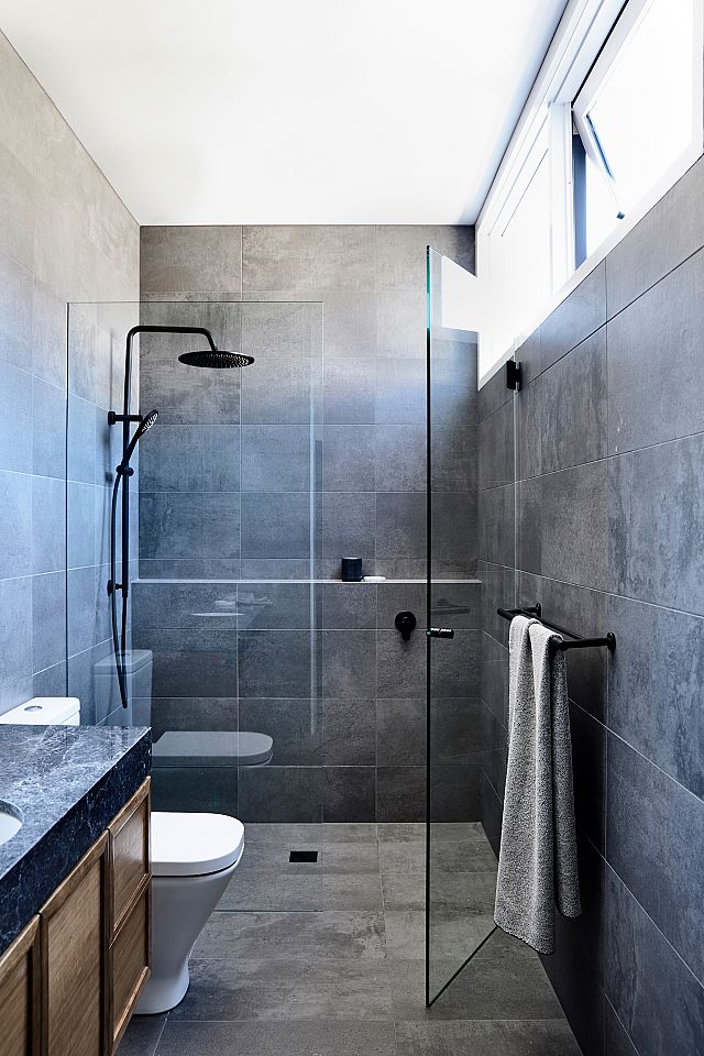
The project saw the studio designing for a couple who had lived in the house for 25 years, with their children now grown up and moving out of home, the brief was centred around creating the next chapter in both the house and the family’s lives. “The house needed to reflect the way they live today, which has changed over time, now with adult children who come and go regularly,” says director Luke Fry. The owners sought to improve the dark and dysfunctional spaces of the house, primarily the ground-floor kitchen, meals and laundry, to create more open and connected entertaining spaces both indoor and outdoor, as well as adding an additional bathroom.
“The connection between old and new was very important,” continues Luke. “In some cases, it’s best to create a clearly defined line between old and new, however, in this particular case the line is very blurred. In essence, the spaces and their locations are very similar, it’s the design and function of those spaces which is vastly improved and enhances the daily use of the space.”
This approach was made possible by the fact the original art-deco building was in unusually good condition, allowing many original features to be maintained. “Built in 1935, the freestanding double-storey solid brick house sits on a 740 square-metre site at the end of a cul de sac street. Compared to our many other projects, we had few limitations on the site, site access was easy and the building was in exceptional condition for its age. We consider the combination of all of these elements to be very rare in an inner-urban context,” reflects Luke.
With a new palette of timeless natural materials, old and new coexist peacefully, neither seeking to dominate the other. As a result, both the old and the new gain something from their proximity to each other, in some cases providing direct references, in others juxtaposing the original period features with the contemporary design. “Given the nature of the project, the exterior only utilises two materials, steel and concrete,” says Luke.
The exterior plays with a contemporary aesthetic with the intervention of the black steel pergola, whose simple materiality and strong rectilinear forms act as a deliberate counterpoint to the dramatic and unmistakably 1930s curves of the original building. The pergola shelters black steel-framed windows, which open the kitchen and dining up to the garden and outdoor living space, while bringing in much-needed natural light to the previously dark interior.
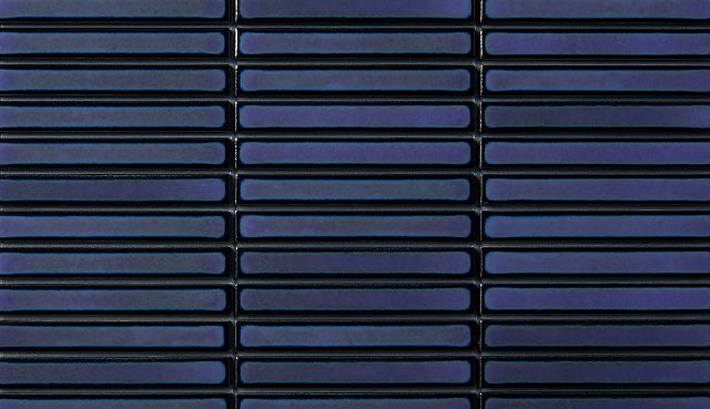
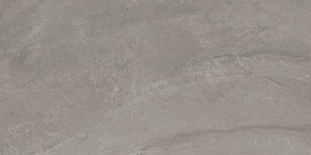
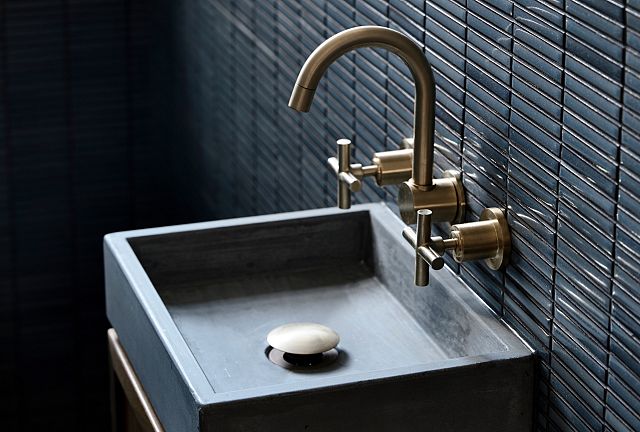
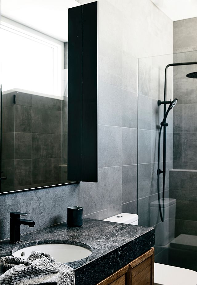
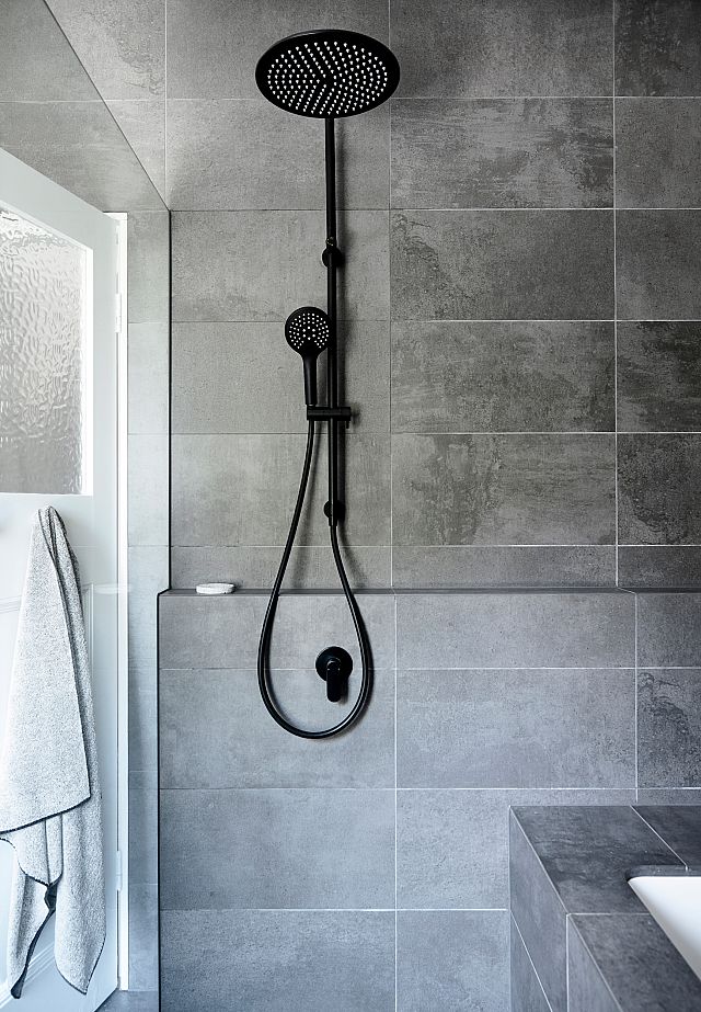
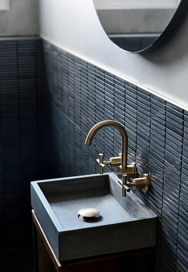
While the exterior opts for a considered, straightforward approach to materiality, Luke says that “the interiors are where the materials palette was pushed and explored.” Blackwood joinery recalls the existing blackwood staircase. Here, the new design overtly responds to the original in both materiality and subtle joinery detailing, creating a kitchen that is warm and inviting yet suitably elegant within the context of the home’s original art deco design. Blackwood is combined with “Sirius black natural stone, Japanese tiles by Inax, porcelain tiles and another grey natural stone called Bedonia, all supplied by Artedomus,” says Luke. “Brushed brass tapware and lighting complement these finishes on the ground floor,” he continues.
Natural stone in the kitchen and bathrooms imparts a sense of refinement and subtle luxury that resonates with the art-deco aesthetic, and while the Inax tiles impart a timeless contemporary quality in their rhythmic texture and natural variation as a hand-made product, these tiles also hark back to the prevalence of intricate tiling in art deco design. Meanwhile, the fine, smooth surface of the porcelain tiles complements the textural natural stone and Inax tiles and contributes a minimalist, contemporary quality that balances the overall space.
“We use samples supplied by Artedomus during the design process to determine size and colour. We have a large collection of these samples in our library and visit the Artedomus showroom regularly,” Luke explains. “We have worked with Artedomus for a long time on a number of projects (including my own home). They have great products and good service; it really comes down to those simple core values,” he adds. “They are always at the forefront of our mind when it comes to stone, tiles and bathroom products. We don’t need to be convinced!”
Through this timeless, considered materials palette and an approach that complements the old with the new, the St Kilda East House sees Luke Fry Architecture & Interior Design open a new chapter for the well-loved family home, grounded in an appreciation for its past.
DESIGNER Luke Fry
PHOTOS Derek Swalwell
STYLING Bek Sheppard
WORDS Rose Onans
This article originally featured on The Local Project.
