Woollahra Residence by Kintore Design is a thoughtful renovation that demonstrates the prospects of working within an existing – albeit challenging – building envelope. Located on a sloping corner block in Sydney’s Eastern Suburbs, this home balances purpose with intrigue through spaces that envelop and release in pleasing succession.
Products
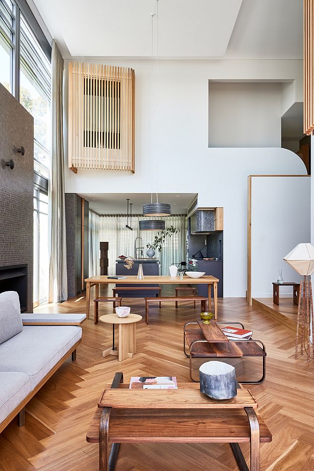
James Kintore of Kintore Design was initially engaged by the client to address the kitchen and open plan living areas in isolation to the rest of the home; however, the scope of work quickly developed into a complete interior refurbishment. “As with any renovation, you often need to go back a few more steps to truly do a building justice,” James says, adding, “I eventually came to the client with a pitch to remodel the floor plan but really maximise what the home already had.”
“Based on [the client’s] feedback, we were able to build a thesis around creating a lot more function, improving the home’s thermal performance and up-speccing everything to a point where he could really enjoy living here,” James says.
The client – who had previously lived in the home for 15 years – was “very articulate in what he wanted” and, as James explains, “based on his feedback, we were able to build a thesis around creating a lot more function, improving the home’s thermal performance and up-speccing everything to a point where he could really enjoy living here.” This approach has proved advantageous in bringing cohesion to the interiority of the four-level, 1990s-era home, with particular attention paid to selecting premium, tactile materials and improving the home’s spatial experience.
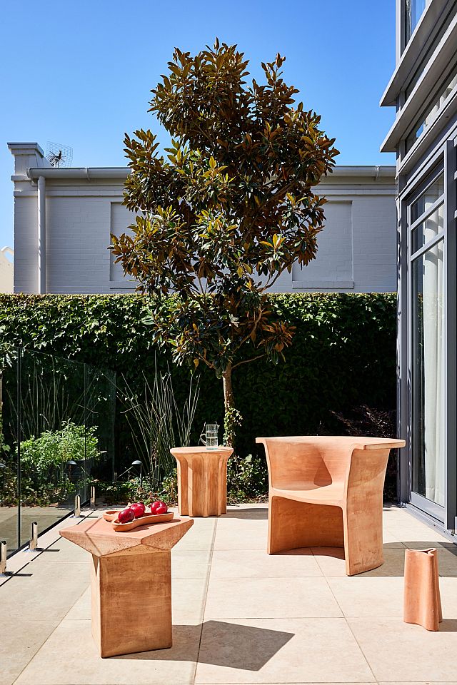
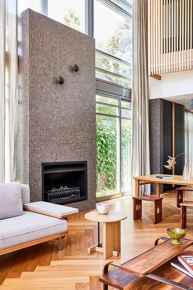
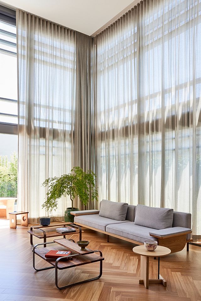
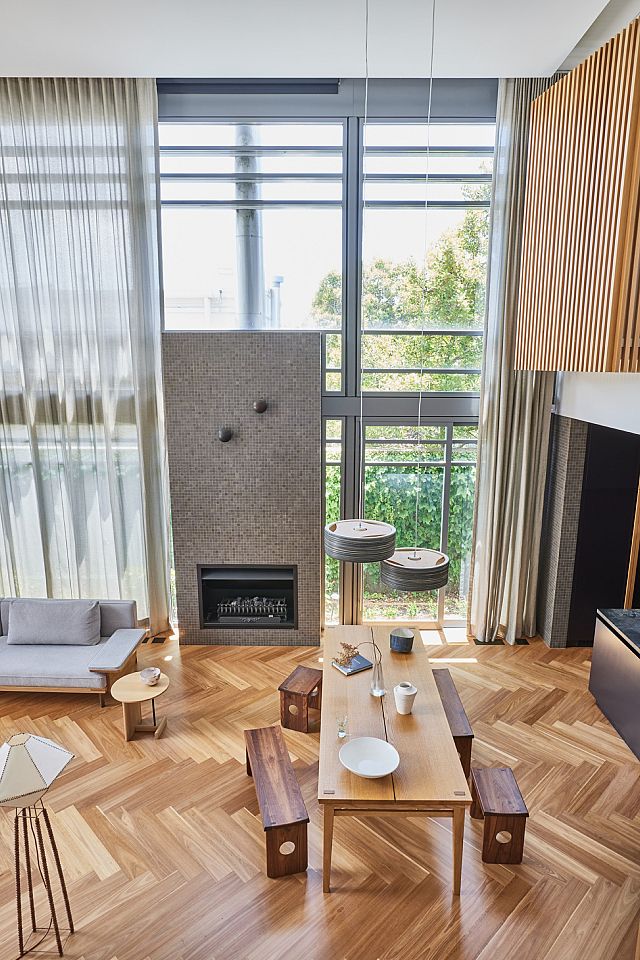
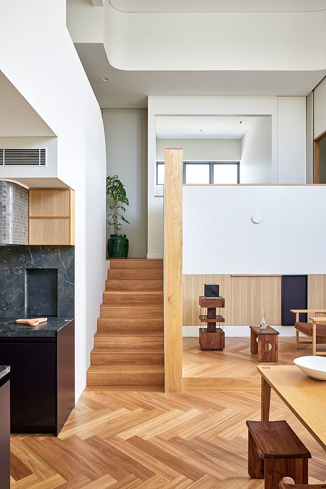
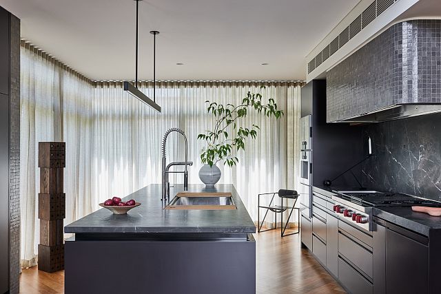
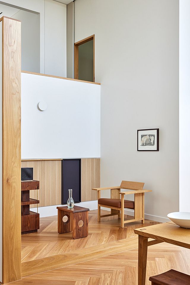
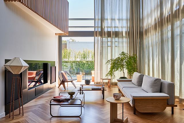
The site’s gradient means the open plan living area – which is stepped down and located deep into the plan – features six-metre-high ceilings with expansive north- and west-facing windows opening onto a compact backyard and a lap pool. This impressive volume of space was undoubtedly one of the home’s assets, yet the orientation and extensive use of glass did little for liveability. “This room gets a lot of afternoon sun, and because there was so much glass it would heat up like a greenhouse and push all the hot air up into the rest of the home,” James explains. Fullheight sheer curtains now span the northern and western elevations, creating much-needed separation and helping to mitigate solar heat gain and reduce sun damage.
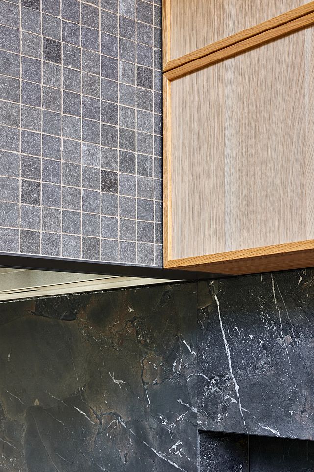
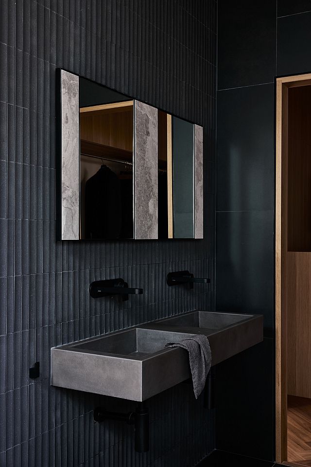
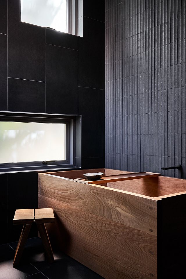
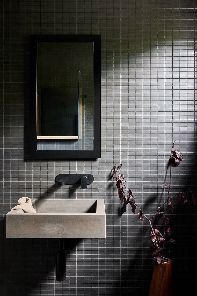
“I wanted to create a sense of age, texture and patina,” James says. “That perfectly-imperfect, worn effect is something I find endearing in homes, and it’s often very hard to nail in a new build, so choosing tiles that had a textural element was crucial.”
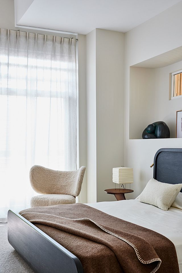
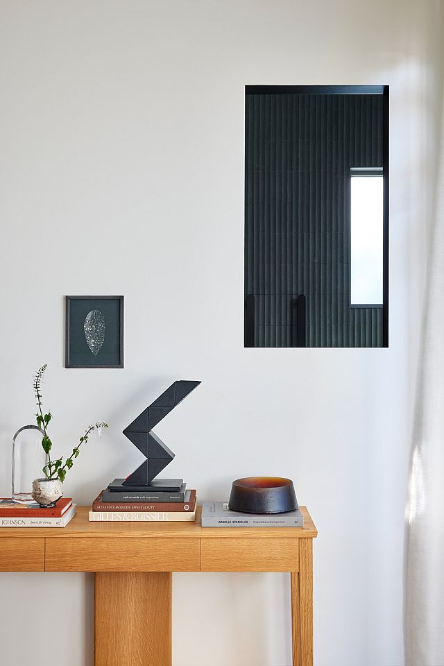
Interestingly, the main and second bedrooms – which are located on the level above – previously featured large openings in their respective void-facing elevations. Fitted with retractable plantation shutters, these openings created the feeling of indoor balconies surveying the living area. Whilst this allowed for borrowed natural light and ventilation, it also resulted in a lack of demarcation. As such, James has decreased the size of these openings, added glass and employed the use of timber battened screens to create privacy but also allow for controlled sightlines and an illusion of space from within the bedrooms. “Previously, it was a limitless void,” James explains. “These angular façades with battens create extra volume in the bedrooms, and they also help with temperature control.”
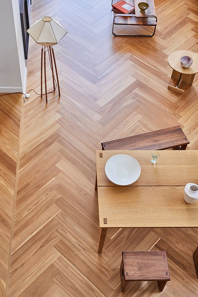
Though the original home’s orientation, context and size were all enviable, the design lacked intimacy and resolve. Favourably, the client saw value in introducing high quality finishes throughout, and thus, a significant focus on materiality was embedded into the redesign. “It used to be quite stark, so it was a great opportunity to bring tactility in from the ground up in the material choices,” James offers. Now, the home’s palette is largely defined by European oak, walnut and tonal paint colours such as creamy whites and greys. “We’ve introduced lots of timber detailing – such as the European oak doorjambs with shadow lines – as well as curtains and brass components in the joinery. It was all based around textured elements and the builder has achieved a very high-quality finish, so we’re really happy with that.” Through his furniture brand Mat and Kin, James has also custom designed and built several pieces of furniture for this project; crafted from walnut and cast bronze, these pieces bring an added level of gravitas to the interiority.
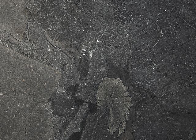
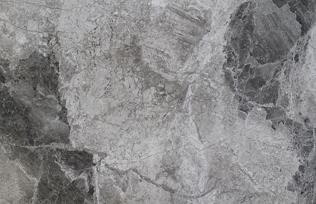
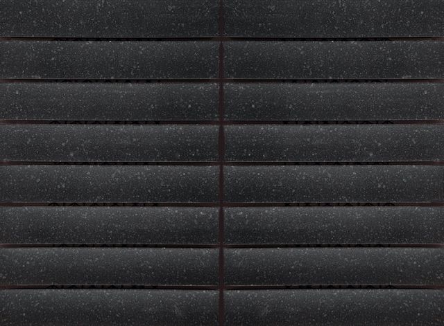
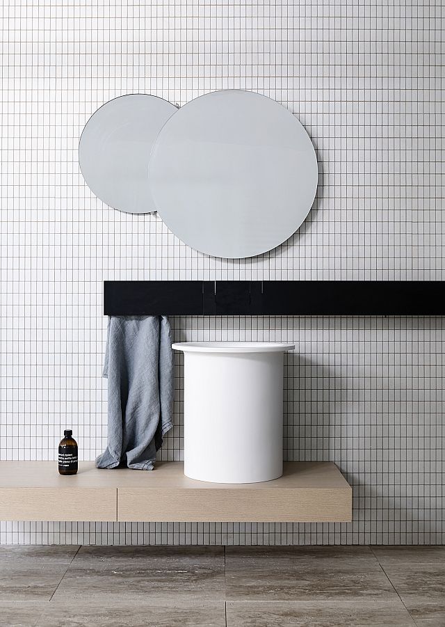
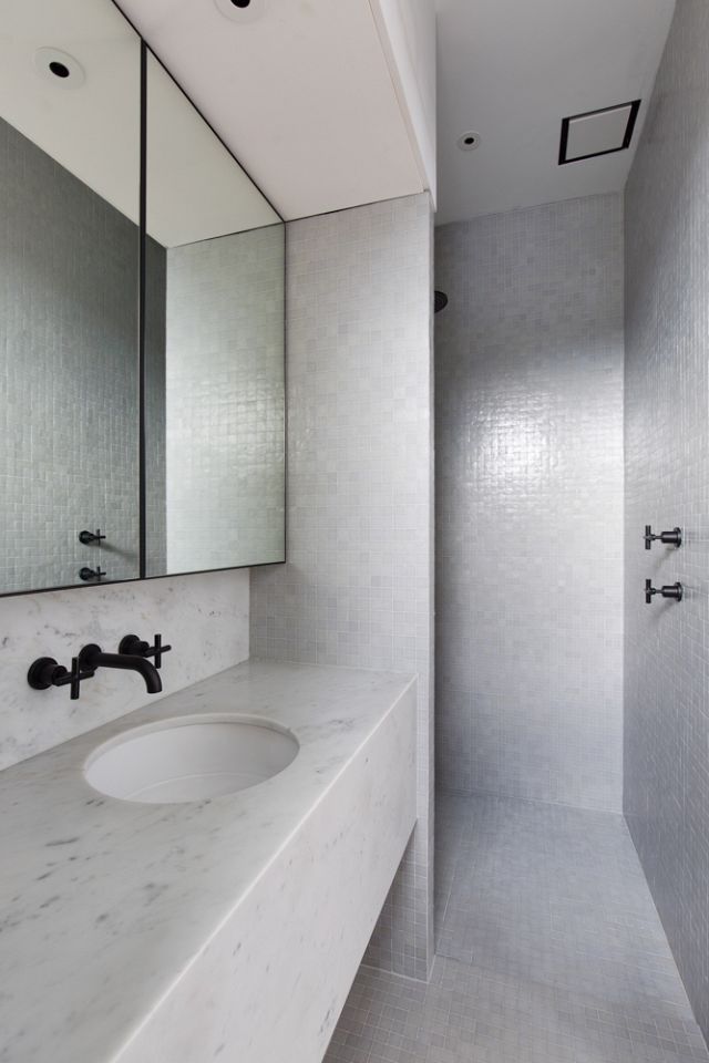
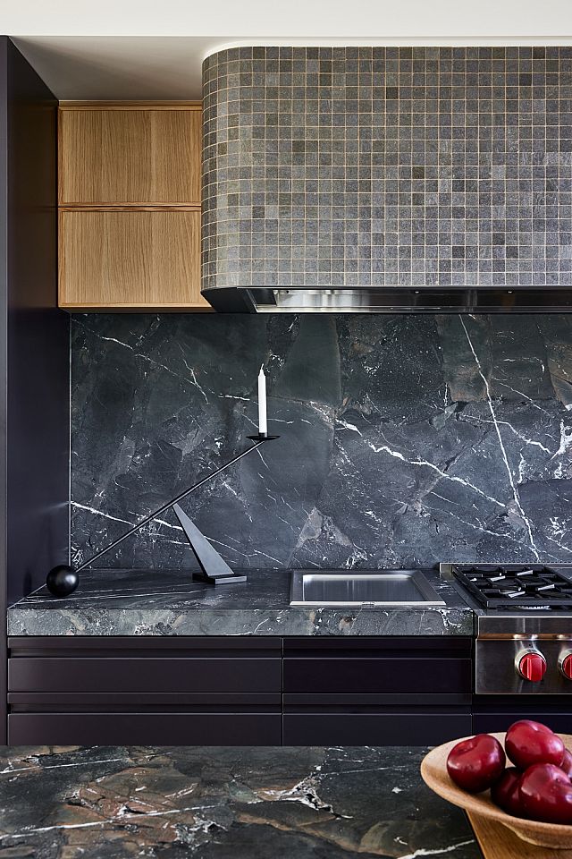
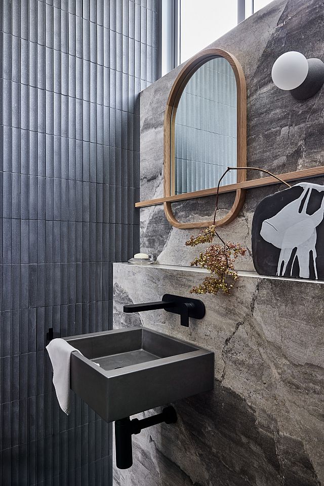
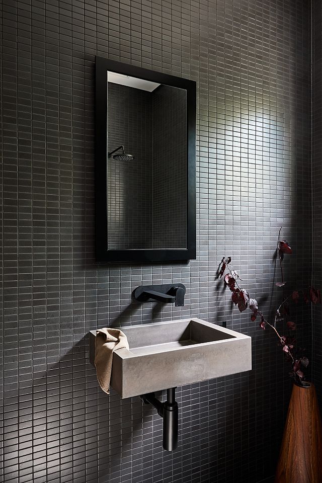
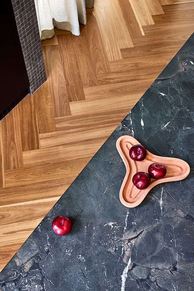
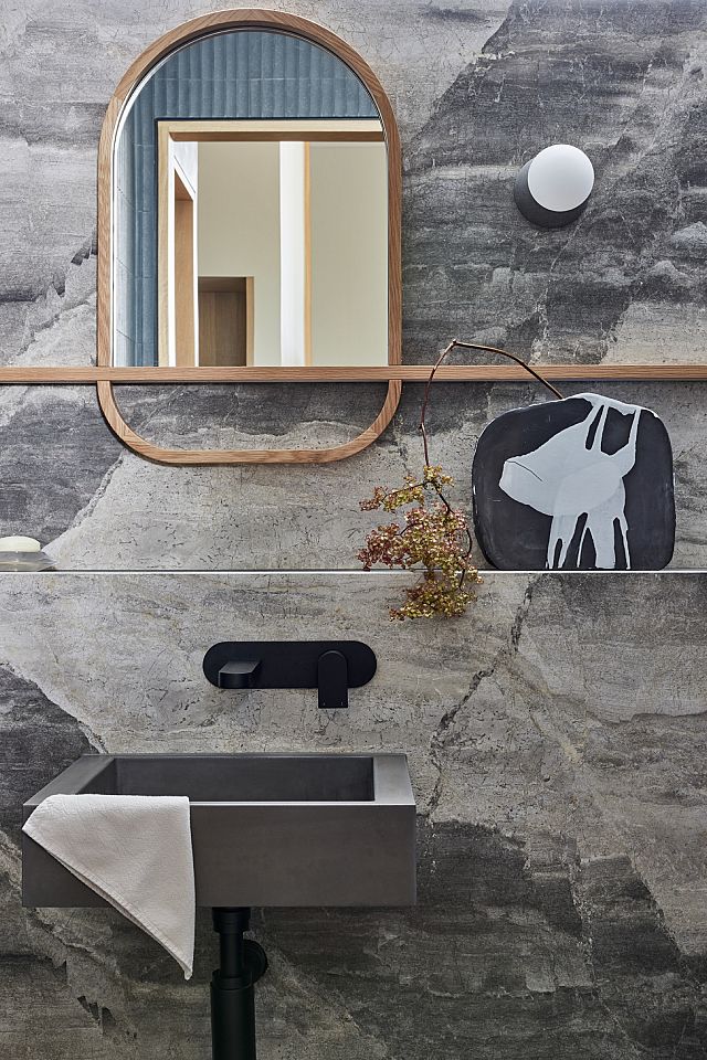
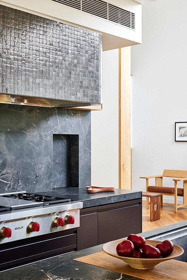
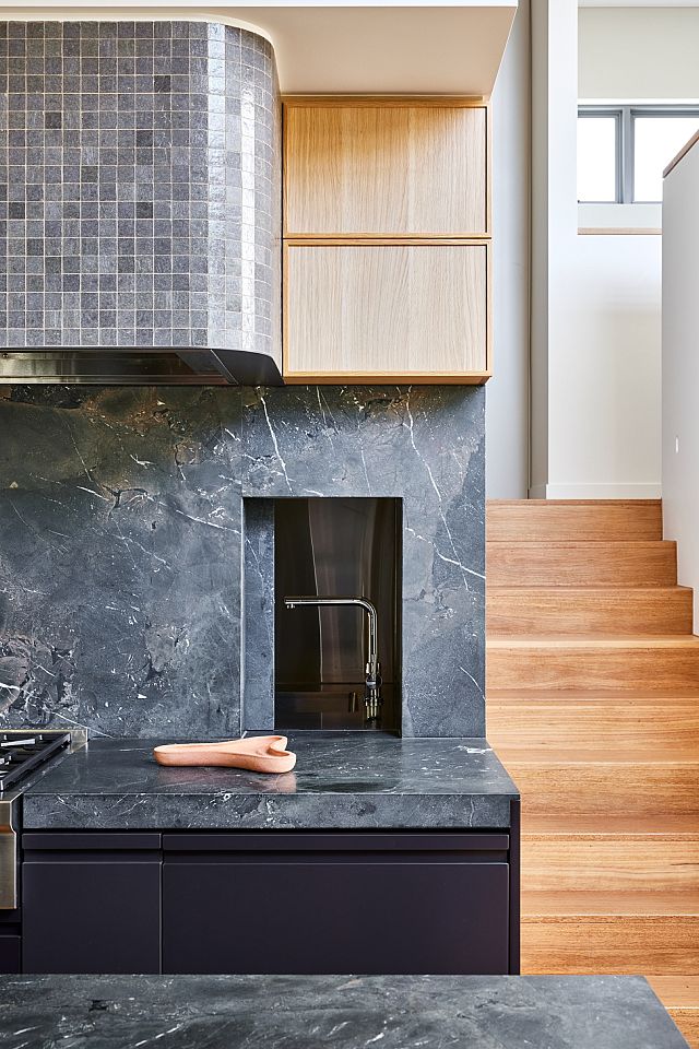
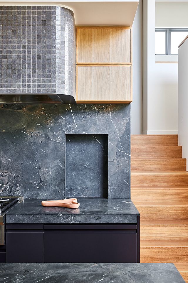
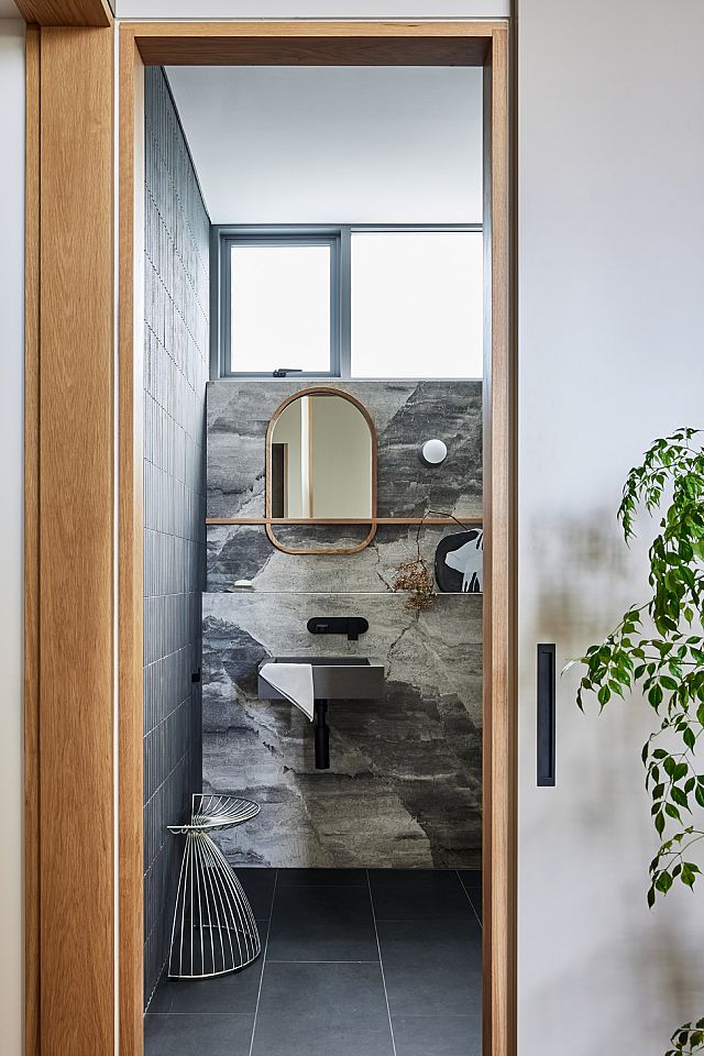
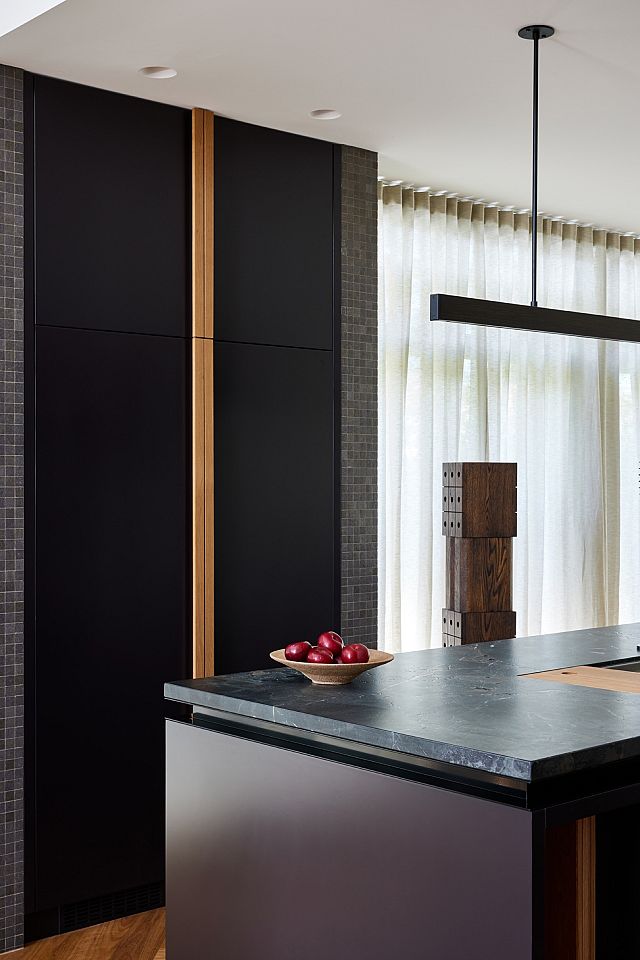
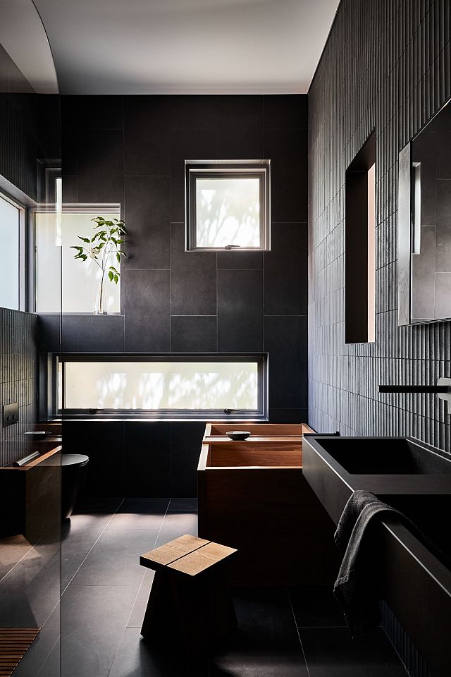
Rounding out the material palette is a layered selection of Artedomus tiles and stones. “I wanted to create a sense of age, texture and patina,” James says. “That perfectly-imperfect, worn effect is something I find endearing in homes, and it’s often very hard to nail in a new build, so choosing tiles that had a textural element was crucial.” In the kitchen, Magnesia – a charcoal-hued, hard-wearing quartzite – spans the benchtops and splashback, and in the main living area, the four-metre-tall fireplace is clad entirely in Vixel mosaic tiles, making for a striking feature with movement and visual interest. The bathrooms also feature an extensive range of Artedomus tiles and stones with two formats of INAX tiles on the walls – Sairin and 2×1 Inch, both in a grey finish – as well as Teragio – a luxurious natural stone with distinctive grey veining. Black Maximum Moon Italian porcelain tiles across the floors complete the moody and sophisticated palette.
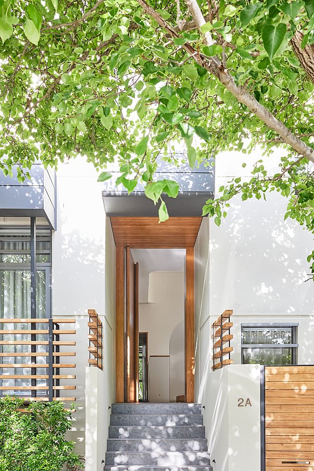
These informed material and colour selections have transformed the spirit of this home, as have some small yet significant changes to spatiality and layout. “Originally, you walked in and saw everything all at once – glass balustrades and high ceilings – and the floor plan was quite frustrating, so we really tried to create some mystery and intrigue.” Thus, the entrance has been remodelled to create more width with space for a bench seat, and nib and curved feature walls bring welcomed delineation to otherwise undefined spaces. Now, upon arrival “you’re greeted with intimacy, and as you walk through the home you slowly get closer to the reveal, which is that large void area and its incredible sense of volume.” He describes this outcome as “a sense of unique experiences” heavily informed by his understanding of the brief, site and client.
Kintore Design’s approach to Woollahra Residence was underpinned by an aspiration to introduce purposeful gestures and thoughtful moments, and cleverly, James has allowed his client’s preferences and habits to guide this endeavour. The resulting home is not only a fitting reflection of its occupant but a place that expresses an enhanced liveability and a newfound sense of rationale.
Words by Millie Thwaites
Photography by Pablo Veiga
Build by Buildline Constructions
Interior Design by Kintore Design
Furniture Design by Mat and Kin
Stone and Tiles by Artedomus
